The Psychology of Color in Exhibition Stall Design
- Think Shaw
- Jan 5, 2024
- 3 min read
Updated: Apr 30, 2024

Have you ever wondered how some trade show booths performed outstanding despite having fewer resources than you?
Well, the answer may be hidden in selecting the perfect color theme.
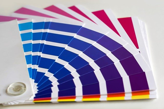
Just like in daily life, humans appeal to a product based on its hues the same goes for them selecting and stepping in the trade show flooring. So, overlooking the color combination diverts prospective customers despite the great potential of your product/service. This psychology of colors makes or breaks the first impression of the stall. Let us know more by entering the world of color influence.
Mastering Color Psychology for Effective Booth Display
Selection of colors
Understand Color Associations
Knowing how colors make one feel is essential as it represents the psychology of colors in tradeshow booth creation. Since every color has its impact on the psyche of the individual. If we talk about the colors, blue makes people feel calm and trustworthy, giving a reliable vibe. Red brings energy and urgency, making people pay attention. White is simple and pure, providing a clean background. Picking the right colors helps convey the right feelings so people understand your brand message simply and subtly.
Undefined Audience
You often have to deal with visitors with no demographic division, from youngsters to mature to experienced, and then selecting appealing and soothing colors becomes inevitable. As it will give your booth a unique look and attraction. Combining earthy(Olive green and Muted blue) and energizing tones (Mustard yellow and Burnt orange) creates a balanced and sophisticated atmosphere. Younger visitors are drawn to the lively bursts of color, while experienced individuals appreciate the timeless and calming aspects of the earthy palette.
Lighting Effects
Strategic Lighting Placement:
Use spotlights or focused lighting to highlight key elements of your booth, such as featured products, signage, or interactive backlit displays. It helps direct attention and emphasizes specific areas.
Consider backlighting certain features to create a sense of depth. This effectively showcases translucent materials or graphics and can add a dynamic element to your booth.
Accent Lighting for Colors:
Incorporate accent lighting with colored filters that complement your booth's color scheme. This can intensify specific hues and create a more immersive experience for visitors.
Experiment with contrasting colors in lighting to make certain elements stand out. For example, use warm lighting against cool-colored backdrops or vice versa to create visual interest.
Where to use these colors
Highlighting Key Products or Displays:
Selecting bright and contrasting colors for your product lighting creates a visual contrast against the surrounding environment. This contrast helps your trade show necessities and products stand out and enhances their visibility, even from a distance. For example, vibrating colors against a neutral or dark backdrop immediately grab attention.
Pair vibrant colors with neutral tones for maximum impact.
Choose complementary colors that are opposite each other on the color wheel. For example: Orange (Vibrant) against Blue (Complementary)
Combine warm (deep burgundy) against cool colors (teal blue) for a high-contrast effect.
Navigational Guidance:
Using different colored lights to guide visitors through your booth is an effective way to create a curated and engaging experience. Here's how you can implement navigational guidance with colored lights and which colors to consider:
Path Definition:
Choose a primary color that defines the main path or walkway through your booth. This color will act as a visual cue for visitors to follow.
Gold accents for signage and critical areas
White for product displays and information points
Turquoise for product displays and interactive zones
Charcoal gray for a sleek backdrop that allows other colors to pop.
Interactive Elements:
Incorporate dynamic or interactive lighting elements to capture attention. For instance, use color-changing lights or lights that respond to visitor interactions.
Do not go overboard
Creating a brand color palette with different shades or tones of the same primary color can be a sophisticated and cohesive way to design your booth without going overboard or appearing spammy. Here are some tips to guide you:
Create a spectrum of shades by exploring lighter tones for openness and brightness and darker tones for depth and sophistication, building on the primary color.
Assign specific shades with a purpose in mind. For instance, use lighter tones for backgrounds or larger surfaces and darker tones for accents or focal points.
Avoid including too many shades. Stick to a limited palette to maintain simplicity and prevent the booth from looking cluttered.
By effectively applying the psychology of colors, the prospective customers get attracted to the booth. Having the right color in the stall is a prerequisite that often helps turn visitors into permanent clients. So, before selecting your booth and its surroundings, research or contact Exhibit Boss.


Commentaires